Top 10 website design tips for beginners
Web design can be a fun and creative process, but there are also technical aspects that come into play to ensure the design is functional. Here are ten essential tips to help beginners get started:

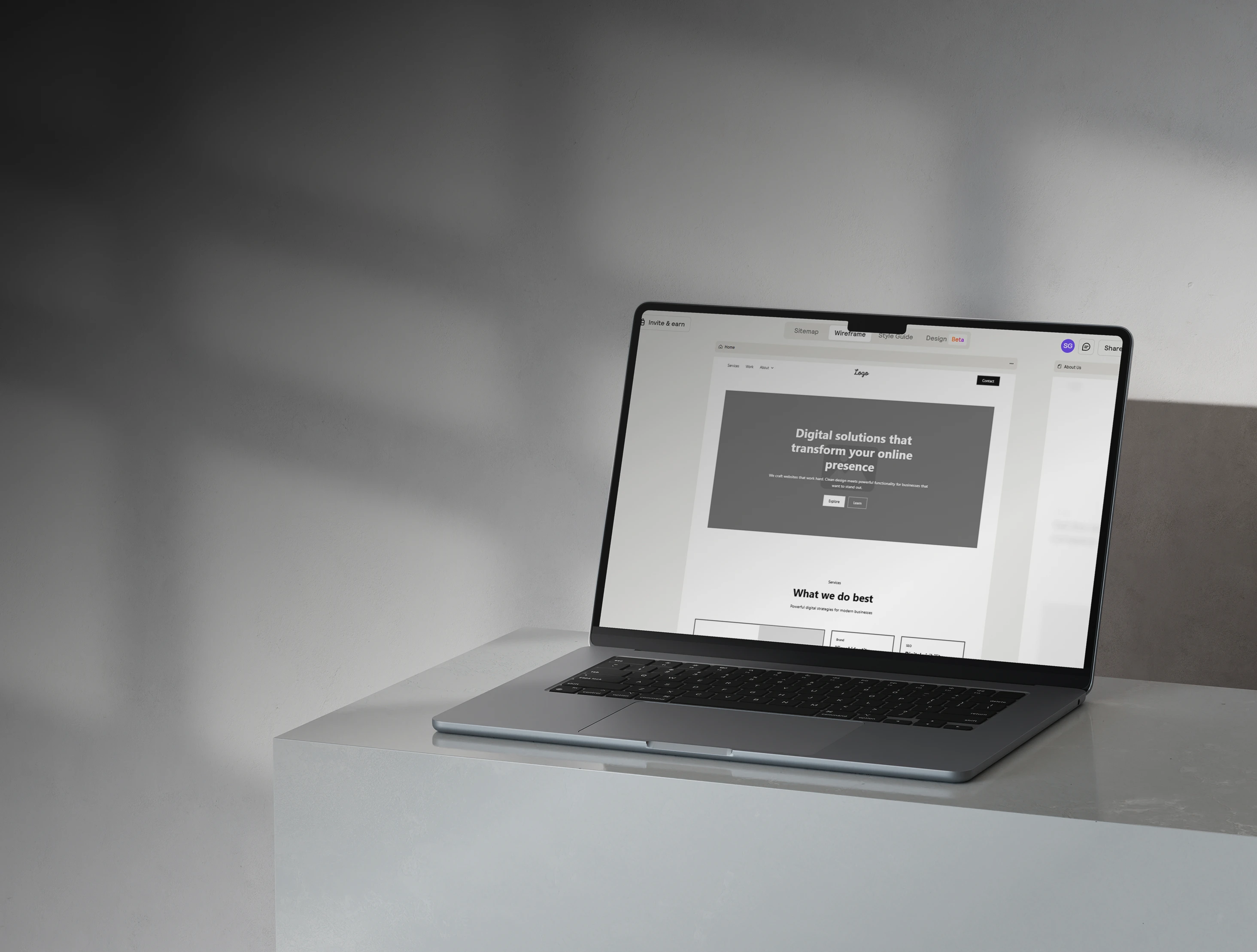
.jpg)
1. Keep your design clean and simple.
A well designed website will have information well laid out and should be easy for the user to find what they're looking for. If you don't include appropriate padding around the different elements it will be difficult for the reader to figure out what content is grouped together. Simplicity will not only improve the look of the site but also improve user experience and engagement.
2. Focus on easy navigation
Visitors should be able to navigate to the different pages of your site with ease. Nobody wants to spend more than 5 seconds looking for a specific page and if a user struggles with this chances are they will just leave the site. Make sure navigation elements are clear and labelled appropriately. You might want to think about leaving a breadcrumb trail on the site to make it easier for users to go back to previous sections.
3. Make your website mobile friendly
Most internet users are now browsing on mobile devices, which means making your website responsive is not just optional, it is a non-negotiable. This means making sure your site adapts seamlessly to different screen sizes and breakpoints, with text being legible, buttons being touch-friendly and images optimised. A well responsive site will also help with SEO.
4. Choose a consistent color palette
You probably have a specific color palette for your brand. These should be consistent throughout your website. The standard is to pick 2-4 colors, with one being white, one black and one accent color. You can use tools like canva or Figma to sketch out a brand style guide that will include your brand colors. Before designing the site, you should spend some time creating a style guide for the site. Include the colors along with their hex codes.
5. Use high-quality images
Low quality or irrelevant images can make even a well-designed site look unprofessional. Use high-quality images from stock photo libraries such as unsplash, pexels or shutterstock. If you have the budget you can invest in a photographer or videographer to take professional images for your site. Most of the time when starting out, stock photos will do the job.
6. Use consistent typography
I have seen too many businesses try to mix 3 or 4 different fonts on the same page or even in the same section of a page. This just results in a messy and unprofessional look, which is not what you want. When creating your style guide for the site, include 1 or 2 fonts max to use in your site. This will make sure you don't get distracted and try to mix too many.
7. Ensure fonts and texts are readable
Most business owners might not think how important of a role typography plays on a website. The type of font that you use can affect the overall experience of the site. Choose clean, easy-to-read fonts with consistent sizes and spacing throughout. Also, make sure that text contrasts well with the background. If you have a light background, make sure the text is dark. Users shouldn't have to struggle to read the text.
8. Include clear calls-to-action
Every page should have a specific goal and a clear call-to-action - whether that's making a purchase, booking a call, or subscribing to a newsletter. Use action-oriented language and consistent button types throughout. A strong CTA can help increase conversions.
9. Optimise for SEO from the start
This can be where a lot of businesses fall off when designing their own websites. They neglect the necessary basic SEO to ensure their site will show up well on search engines and elsewhere. When it comes to basic SEO, the essentials include:
- Proper heading structures (H1, H2, H3 etc)
- Proper page titles
- Descriptive meta tags
- Appropriate alt tags on images
- Keyword-rich content
- Submitting a sitemap to Google Search Console
These things make sure that search engine's page crawlers can properly scan your site so that it will show up when someone makes a relevant search.
10. Finally, test before and after launch
To ensure that your site is fully functional it is important to run thorough tests both before and after launch. These are the things you should be looking at before and after launching your website:
- Test your site across multiple browsers
- Test on multiple devices (desktop, tablet and mobile)
- Test page speed using free page speed tools (Google pagespeed insights)
- Ensure all buttons work
- Ensure any forms work correctly and submit successfully
- Check page titles, meta descriptions, alt tags
- Have a friend or family member scan through the site. Sometimes a fresh pair of eyes can help
Launching a website is an exciting step, but taking the time to test everything before going live will ensure a smooth experience for visitors and sets your brand up for success. By using this pre-launch checklist you can be sure your site will provide a positive experience for users and make a strong first impression. Your website is often the first touchpoint with potential customers, so make it count.